New Layout for my Blog. What do you think?
As a web developer, I’m always tinkering with my blog. You probably never notice many of the changes that I make.
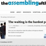
However, some changes are obvious, such as the new layout on the blog as of last night.
I tried to find a layout that was less cluttered and easier to read. Is there anything about this layout that make it harder or easier to read? Is there anything missing in this layout that was in the old layout that you would like to see back here?
I’d love to hear your thoughts on this new layout.
I think the white on white is hard to read, everything kind of washes out. Maybe two columns, the stuff at the bottom is waaaaaay down there. I also think you need a prominent link to my blog right at the top
It’s very…bright. I was going to buy some RayBan’s for summer anyway.
yeah…i liked the old one better
I think I understand now, your background picture is of a sleeping polar bear in a snowstorm!
Alan,
Hard on old eyes, both the white and the font size. I like the layout!
I changed the white background in the header to the same as the lower part.
Also, I increased the font size a little.
Is that any better?
-Alan
much cleaner – easier to read
The font is a little better but the white background with no contrast is still glaring. Maybe a nice beige?
I like it. The two column layout is popular for a reason.
Alan,
Better!
I am viewing on a laptop. My general thought is that the three background colors (outer, post, and side column) are so similar and so light that I find myself squinting to define the borders. Just a little more contrast would help me. Mostly I read your blog through the rss feed, and come to the site just to comment or read comments to particularly interesting posts.
Oh, and the sidebar needs a little more padding on the right side.
Great work
Like anything, I’ll have to get used to it, and I forget what the old one looked like. But, I like the single grouping of tabs just below the header, as it makes it easier to find “home.” I notice you’re now going with a single right margin, and it looks shorter. I’ve wondered about making mine a double-wide, but maybe I should shorten the single instead and make better uses of tabs.
Overall I think it’s an improvement. 🙂
Everyone, Thank you again for all of your help. I will probably continue tweaking the layout over the next several days and weeks.
-Alan